The way your SaaS website is designed shapes how prospects perceive your product, how quickly they move through the funnel, and whether they take the next step toward becoming customers. Strong design builds trust, clarity, and momentum; weak design leaves opportunities on the table.
But design impact can’t be measured by surface-level metrics like pageviews or bounce rate alone. To understand whether your website is truly doing its job, you need to track performance through the lens of outcomes that matter to SaaS growth. That’s where a focused set of key performance indicators (KPIs) comes in. In this article, we’ll break down the six essential KPIs that reveal how well your site design supports engagement, conversions, and revenue.
1. Visitor-to-Trial (or Demo) Conversion Rate
What It Is
This is the percentage of unique website visitors who sign up for a free trial or request a product demo. It's the single most important metric for gauging the effectiveness of your SaaS website design in generating qualified leads.
Why it Matters for SaaS Website Design
A low conversion rate often signals a disconnect between your value proposition and the user experience. The design may fail to communicate benefits clearly, CTAs may be weak or hidden, or the user flow to conversion may be confusing. Your website's primary job is to convert interest into action, and this KPI measures that success directly.
How to Improve this KPI with Strategic Design
Optimizing conversion rates requires understanding user behavior on a granular level. This is where continuous improvement becomes critical.
- Spot On’s Data-Driven Design Retainer is built for this purpose. We use behavioral analytics tools like Hotjar to analyze user session recordings and heatmaps, identifying exactly where users drop off. Based on this data, we A/B test CTA copy, redesign confusing layouts, and streamline the path to conversion, ensuring your design is always evolving to maximize leads.
2. Form Abandonment Rate
What It Is
This KPI measures the percentage of users who start filling out a form (e.g., a demo request or trial signup) but don't complete the submission.
Why it Matters for SaaS Website Design
A high form-abandonment rate is a clear indicator of frustration. Potential customers are interested enough to start the process but are deterred before finishing. Common design-related culprits include:
- Asking for too much information
- Having unclear field labels or instructions
- Raising concerns about data privacy
- Having poor mobile usability
How to Improve this KPI with Strategic Design
Reducing headaches driven by form complexity is a high-impact, low-complexity task. The goal is to make submission as effortless as possible.
- A Spot On Website Performance Audit can quickly identify problematic forms. Our UX experts provide actionable recommendations, such as simplifying fields and adding trust signals (like a link to your privacy policy).
- For ongoing optimization, our Data-Driven Design Retainer implements and tests form variations to find the highest-performing option, ensuring you capture every possible lead.

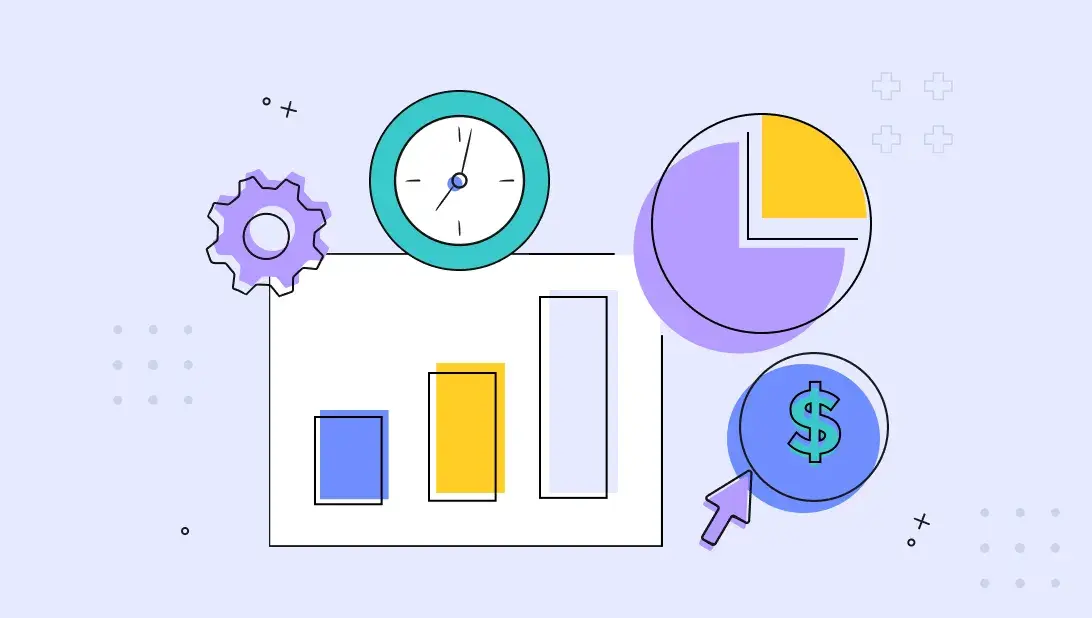
3. Pricing Page Engagement
What It Is
This isn't a single metric but a collection of KPIs related to your pricing page, including its exit rate, average time on page, and click-through rate on pricing plan CTAs.
Why it Matters for SaaS Website Design
The pricing page is a critical decision point. If visitors leave from this page (high exit rate) or don't engage with the plans, your design is failing to communicate value effectively. The layout, feature comparison, and overall clarity of your pricing tiers are purely design-driven elements that heavily influence a buyer's decision.
How to Improve this KPI with Strategic Design
A successful pricing page builds confidence and simplifies choice. It should clearly highlight the value of each package and guide users to the best option for their needs.
- If your pricing page is fundamentally confusing or misaligned with your product's value, a full redesign may be necessary. Our redesign process includes page strategy development to ensure the page structure and copy answer key user questions and persuade them to convert.
- For existing pages that look good but miss the mark, our Data-Driven Design Retainer can test different layouts, highlight the most popular plan, and add social proof like customer testimonials to reduce hesitation and increase conversions.
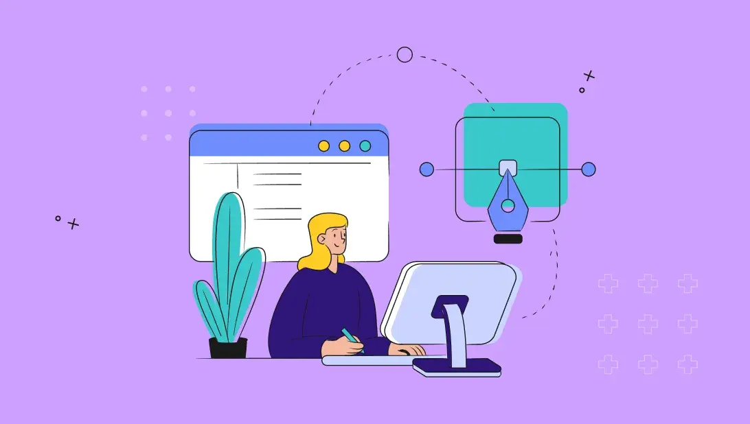
4. User Engagement Metrics (Average Session Duration & Pages Per Session)
What It Is
- Average session duration: The average amount of time visitors spend on your site during a single session
- Pages per session: The average number of pages a visitor views before leaving
Why it Matters for SaaS Website Design
Longer sessions and more pages viewed suggest that visitors find your content valuable and your site easy to navigate. A well-structured design with a clear information architecture and intuitive navigation encourages exploration. It signals that your site is successfully educating prospects and moving them through the buyer's journey.
How to Improve this KPI with Strategic Design
Improving engagement starts with a strategic foundation that maps the user journey.
- A Spot On Website Strategy and subsequent Redesign Project is the most effective solution for systemic engagement issues. Our strategic process begins with creating detailed sitemaps and user flows to ensure the entire site is structured logically. This foundational work guides visitors seamlessly from their first visit to the final conversion, naturally increasing session duration and pages viewed.
5. Bounce Rate & Exit Rate
What It Is
- Bounce Rate: The percentage of visitors who visit a single page and leave without taking any action, like clicking a link or filling a form
- Exit Rate: The percentage of visitors who leave your site from a specific page, even if they've visited other pages before it
Why it Matters for SaaS Website Design
A high bounce rate often indicates that your page content doesn't match the visitor's expectations or that the design fails to quickly capture their attention. A high exit rate on a key page in a conversion funnel (like a checkout or demo page) points to a specific point of friction.
How to Improve this KPI with Strategic Design
Reducing bounce and exit rates requires a modern, user-centric approach that prioritizes clarity and speed. Poor user experience, slow load times, and lack of clear call-to-actions are common culprits.
- If your sitewide bounce rate is high due to a non-responsive or dated look, it's time for a clean slate. A Spot On Website Design Project rebuilds your site on a solid foundation of modern UX best practices, ensuring your brand is perceived as current and trustworthy.
- To address high exit rates on specific pages, a Data-Driven Design Retainer allows for targeted analysis and improvements, fixing the leaks in your conversion funnel without a complete overhaul.
6. Customer Acquisition Cost (CAC)
What It Is
CAC is the total cost of sales and marketing efforts required to acquire a new customer. While not exclusively a website metric, your site's design performance is a major factor in its calculation.
Why it Matters for SaaS Website Design
Customer acquisition cost (CAC) is a signal of how well your website is working as a growth engine.
-
Low CAC suggests your design is doing its job — guiding visitors smoothly through the buyer journey, converting traffic efficiently, and reducing dependence on expensive paid campaigns.
-
High CAC often points to challenges in the experience — unclear messaging, poor conversion paths, or missed opportunities to capture and nurture demand.
How to Improve this KPI with Strategic Design
Lowering CAC requires a holistic approach to your digital presence, where the website functions as a highly efficient conversion engine.
All of Spot On’s Website Services are designed to lower your CAC.
- Our Website Performance Audit provides a quick, inexpensive way to uncover changes that boost traffic and leads.
- The Data-Driven Design Retainer continuously optimizes your site, ensuring it converts a higher percentage of visitors.
- A full Website Design Project serves as a strategic investment to realign your entire digital presence with business goals.
Turn Website Data into Revenue with Spot On
Tracking these six KPIs will give you a clear, data-backed understanding of how your SaaS website's design is performing. However, interpreting this data and implementing effective changes requires expertise.
Spot On offers a suite of services tailored to the needs of B2B SaaS companies, ensuring your website is not just a cost center but a powerful growth engine. Whether you need a Website Performance Audit to identify quick win opportunities, a Data-Driven Design Retainer for continuous optimization, or a complete Website Design Project to transform your digital presence, our team is ready to help you turn insights into revenue. Reach out today to get started.