

The main goal of any website should be to turn visitors into leads. The effectiveness of this process often comes down to the quality of a company’s landing page.
Unfortunately, there’s a common misunderstanding when it comes to the terminology and what comprises a landing page. Companies will often call any page on their site a landing page, but regular site pages don’t function as true landing pages, nor do they follow the critical format needed for lead conversion.
While your company’s site pages may serve many purposes, your landing page should be more focused. You can save information about your company’s history and the full range of products you offer for other website pages.
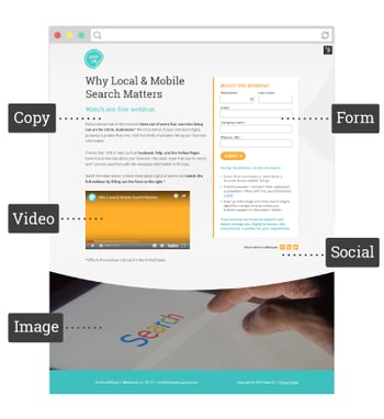
A landing page, first and foremost, is an advertisement for a specific offer available on your site. The goal is to get visitors to submit their contact information in exchange for a downloadable piece of content, a free trial, a demo, or to schedule a meeting. It should present essential information in the most compelling way possible.
Landing pages are typically reached from a search engine results page, an ad, an email, a social media post, or a standard site page. When a visitor arrives to your landing page, the messaging they see should match that ad, email, or social post that invited them to click in the first place. Confusing your visitors is the surest way to drive them away, so the first crucial step is to make sure your messaging is consistent.
Getting the focus right is just the beginning of making your landing page everything it can be. As simple as it looks, a great landing page design requires attention to many details.
We’re not looking at a massive amount of text, so the copy that is there should fire on all cylinders. Everything you write should address your audience, be compelling, and direct visitors toward your primary purpose. This means focusing on the following:
The form you ask the visitor to fill out is the destination point of your entire page. Like your text, it should be concise and straightforward. A few pointers:
We live in a visual culture, and a page without an image will give many visitors the feeling that something is missing. An image can illustrate the content you’re offering to users, such as an eBook, case study, or webinar graphic. However, even if you’re not offering content, find a relevant image to make the page more interesting.
If you’re not sure if you should include an explainer video on your landing page, consider this. According to HubSpot, a video on the page can increase the likelihood of conversion by 80%. A video can demonstrate your product directly or focus on the overall solution your product offers. Videos don’t have to be expensive to be effective, but they should be created with care and professionalism.
Some Tips:
Eliminating distractions is a necessity for your landing page. Create a much simpler version of your footer, devoid of links, and social icons. To keep the visitor focused, your main navigation menu should be absent. Just use a logo to link back to your company’s home page for visitors who want to explore your company further.
When you’re trying to sell the visitor on your product, it helps to show that this isn’t your first rodeo. A couple of well-placed testimonials, as well as logos from satisfied clients, can build trust and comfort.
Include Share and Like buttons on the page. Visitors who are willing to share your page with their colleagues should be able to do so. Every ‘like’ on social media is a micro-conversion!
If your landing page looks great on a desktop or laptop but forces a smartphone user to scroll extensively to get to your form, you aren’t getting the maximum impact from your page. Every year, the frequency of people who use a smartphone to look at web pages increases, and this includes B2B, so make sure your page is optimized for all screen sizes and devices. HubSpot has a smart content feature that allows you to decrease the amount of content shown to mobile users.
Once it’s live, you don’t have to guess the effectiveness of your landing page. A wealth of available analytics can help you pinpoint what’s working and what is not. Some of the most useful:
Once you’ve reviewed the analytics, you can refine your page to maximize its effectiveness. If you’re still not getting the results you want, but you haven’t identified any apparent problems with your page, try testing the ads or CTAs you’re using to bring people there. Remember, it’s vital that they accurately represent what your visitors are going to see when they land on your page.
If you need assistance to implement these landing page best practices, reach out to Spot On and schedule a time to chat about how we might be able to support your company.


As Creative Director and partner at Spot On, Erica Pierce leads the design department with a keen focus on making sure that every aspect of Spot On’s design work meets the highest standards of excellence. She combines creative flair and strategic acumen to bring a holistic perspective to every project. With 14 years of experience in graphic design and publishing platforms, Erica brings an informed approach, ensuring every project she touches delivers a meaningful impact for healthcare companies.
Get the latest and greatest posts sent straight to your inbox.

